Feminine identity design with minimalistic touches
Services
Identity design, Web design and development, Stationery design, Branding Photography
She is a doctor and an artist.
She is passionate as a physician as well as a family person.
She loves to explore problems from different angles.
And there was the need of a new brand system that speaks clearly her brand’s core values.
The base keywords in the design strategy are Care, Intelligence and Human being as well as an identity with a feminine approach and attention to details. Based on this creative direction I develop a visual language using simplicity and minimalistic touches. The main challenge was to design a symbol, that can be used separately on supporting brand materials. A symbol that is relevant to the industry yet welcoming and elegant.
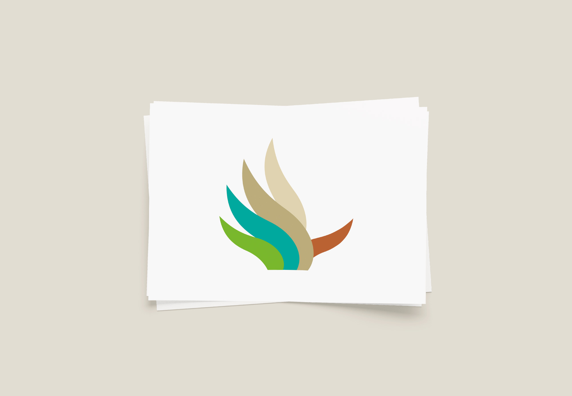
When designing the brand symbol, I used the harmony of five - health, regeneration, love, power and the energy of movement - and the hand shape, that supports the idea of human care. The flower-like pattern represents the upper part of a neuron as well.
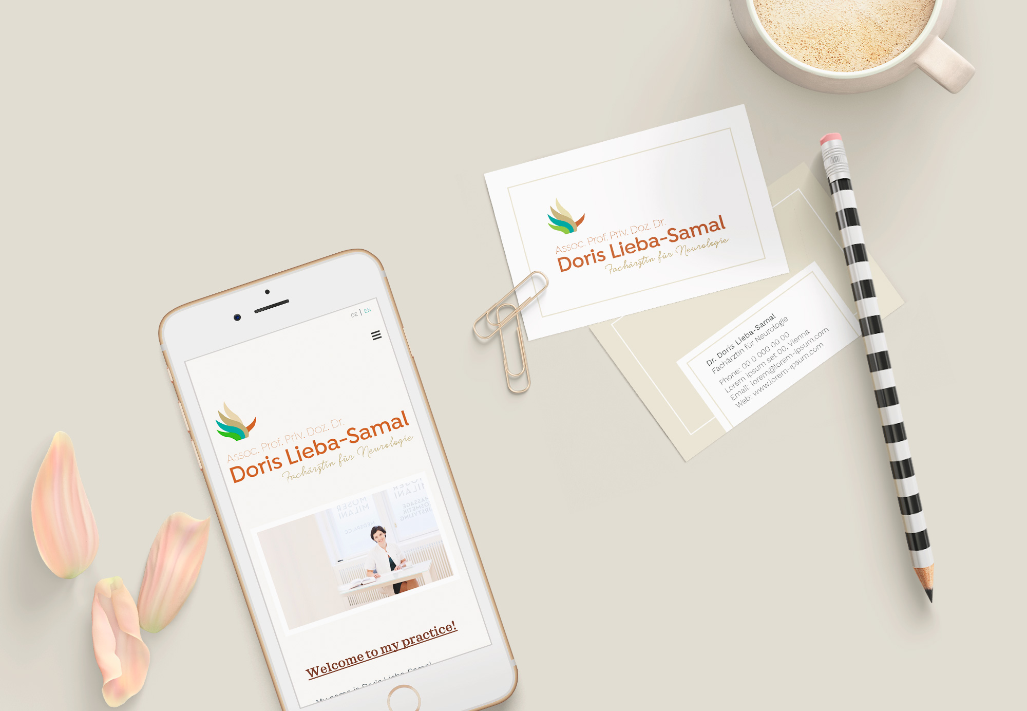
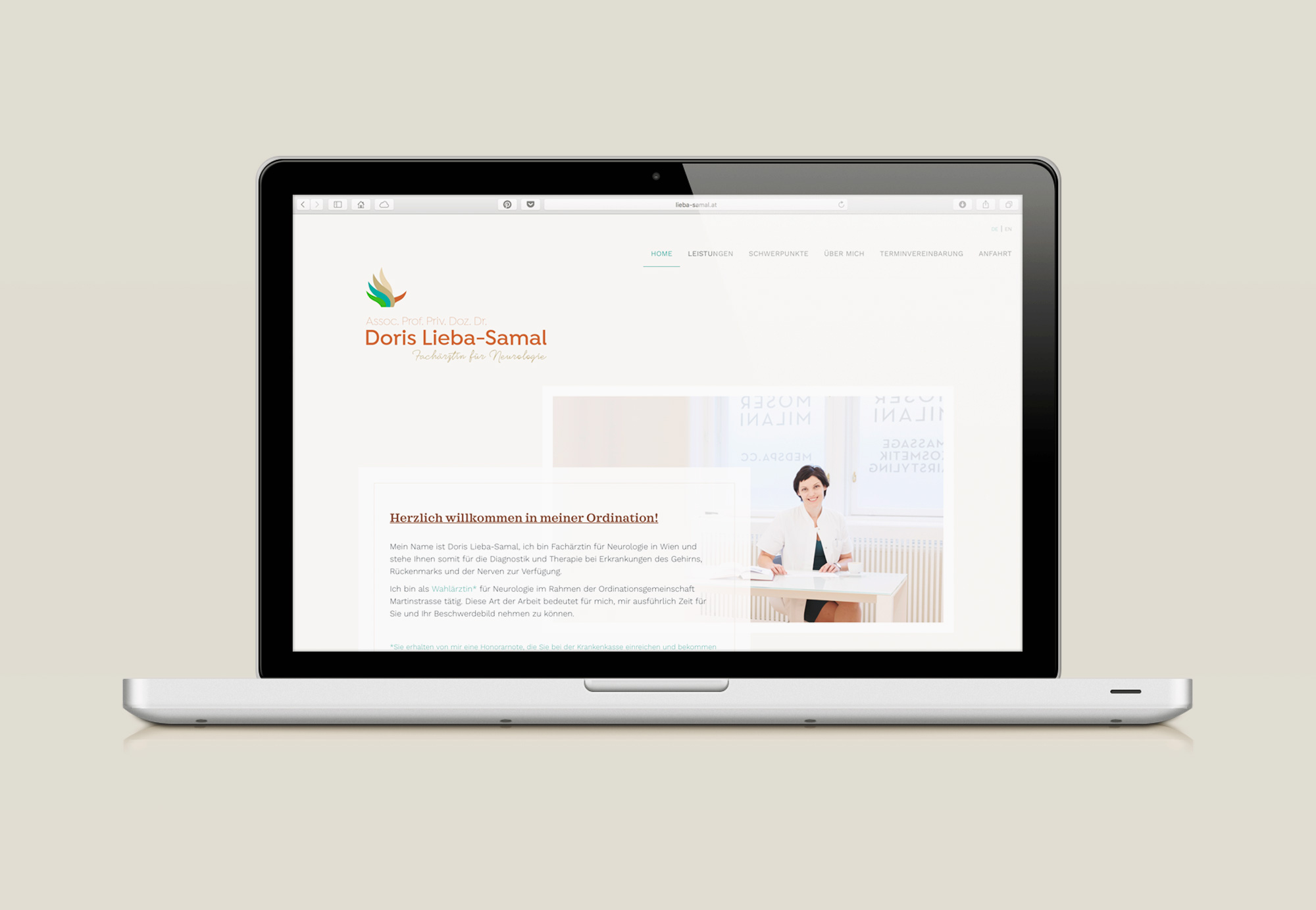
The new branding system includes a Logo, a business card and a website.

